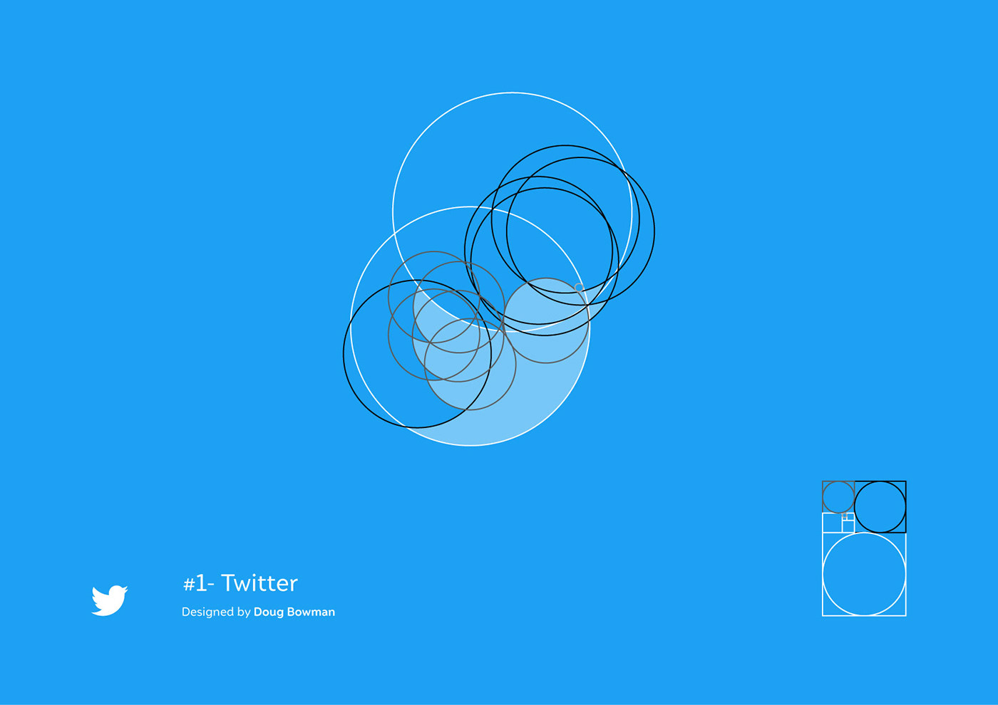
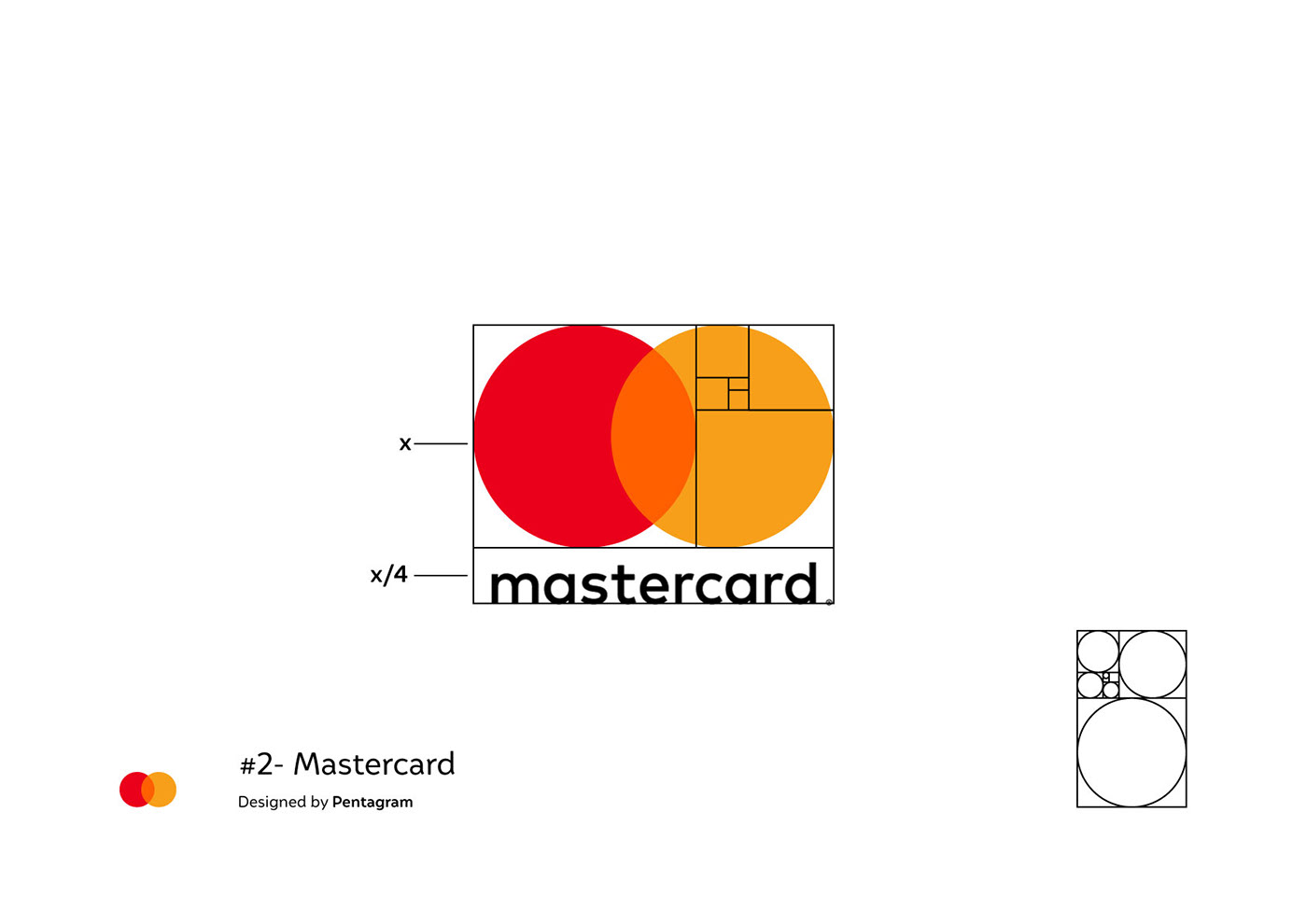
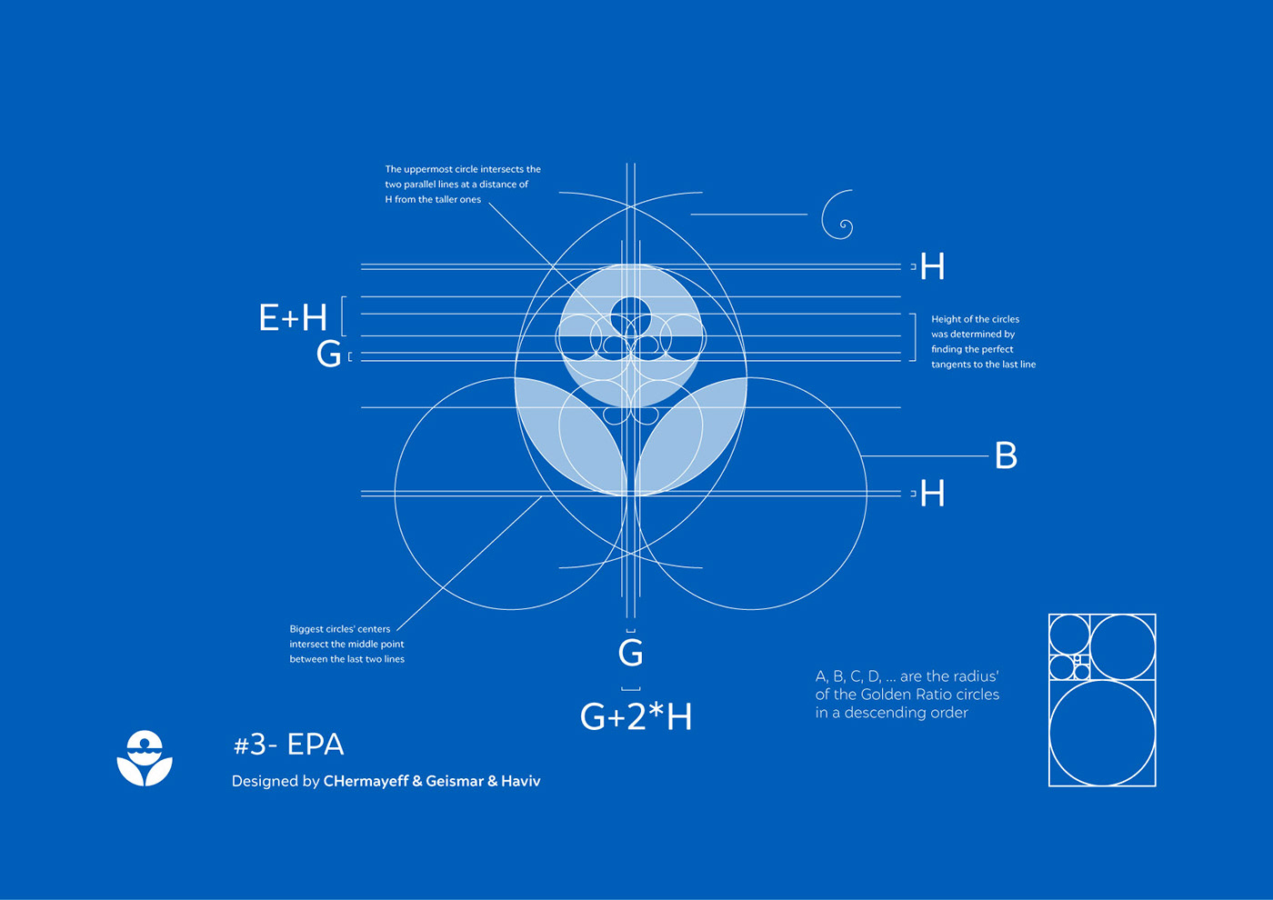
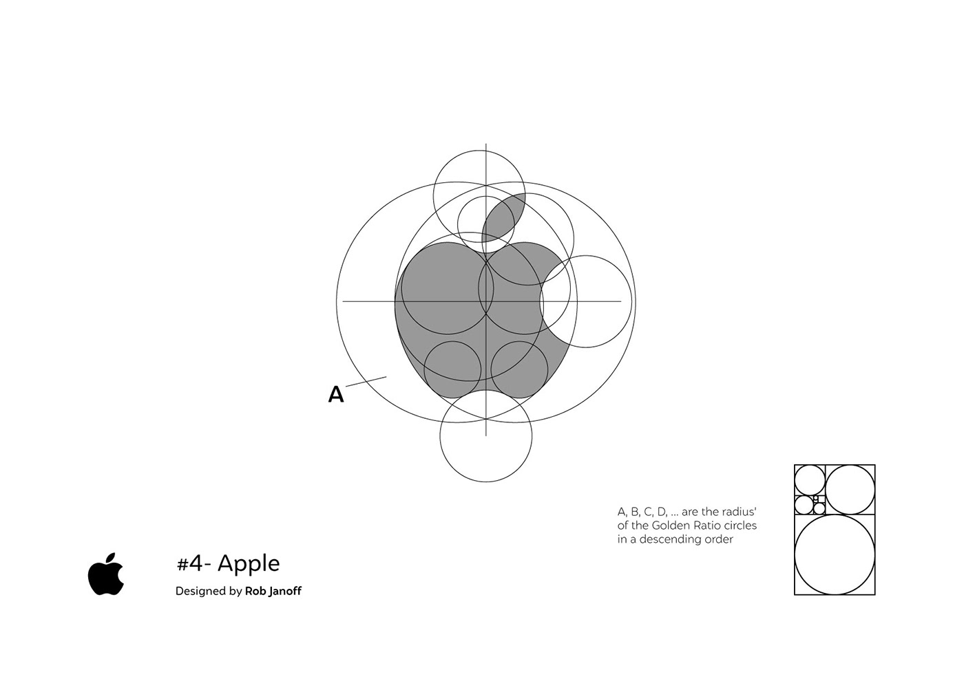
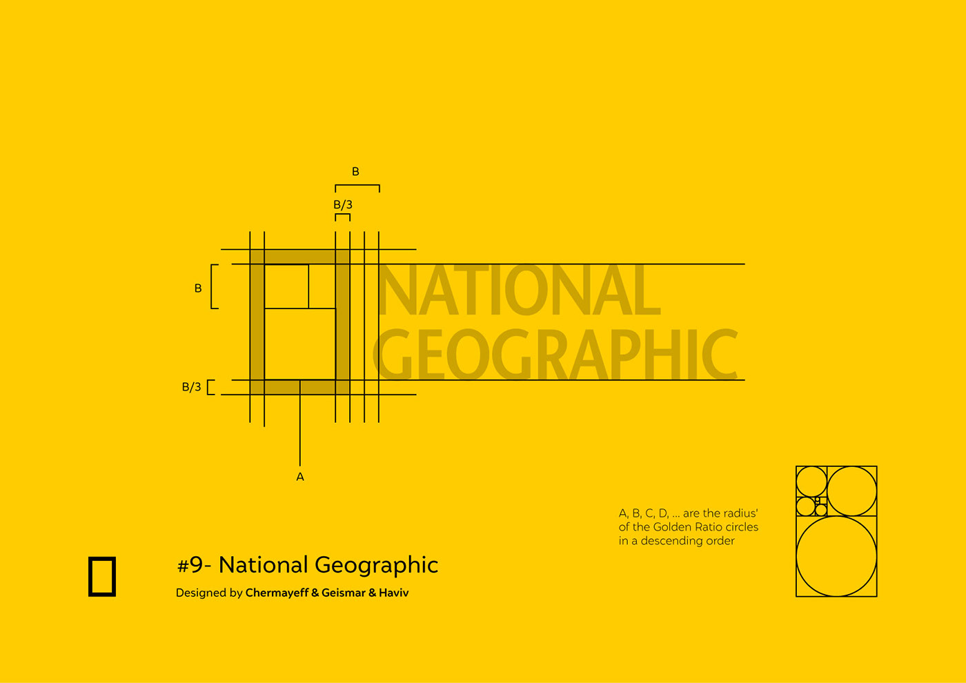
In the past weeks I took over the challenge of studying some famous logos and the underlying mathematics behind them. Some of them were easy to figure out, others were completely monstrous, but the most important thing I learned is that in design, beauty is often coordinated by carefully planned-out adjustments and timeless principles.
The more beautiful and important the logo, the less random every pixel is being pushed.
Disclaimer: I acknowledge the fact that some of the following representations might be stretched-out to fit some mathematic or Golden Ratio calculation. However, you have to understand that even when you design with perfect circles or ratios, optical adjustments that go beyond the grid will always be a necessity. Besides that, thate into account that I might have simply tried to create the grids to fit my own narrative. :)

Thank you, and let me know in the comments if you would like to see more of these kinds of projects, suggestions for logos to study or mistakes that I have made.

